content accessible
publishing non-compliant content
Free Accessibility testing tool
Test your online content for free, to see if it's accessibleand compliant with WCAG standards
Our free WCAG accessibility testing tool identifies
web accessibility issues and shows you how to fix them.
Paste your text into the editor* and press thebutton to check it
Get test results in seconds.
Learn how to improve it for free
*This site doesn't save or store any data that you enter

WCAG 2.1
Compliance
SECTION 508
Compliance
HTML4,5
Compliance
A, AA, or AAA
ComplianceHow to use the accessibility testing tool
1.
Paste your content into the editor above, either directly or as HTML using the2.
Press the3.
Follow the instructionson the in-editor dialogue window to fix any errorsOur web accessibility testing tool helps content authors and creators to efficiently evaluate and improve content before it’s been published. Using an intuitive user interface, the tool assesses the content in line with the WCAG standards (even exceeding them) highlights issues found and makes it easy to resolve them with a single click.
The accessibility testing flags problems, and the free tool then suggests changes, and you can press the ‘Repair’ button to address the accessibility error.
Why bother with online accessibility testing for content?
Making a website accessible can be difficult and time-consuming. A few simple miscalculations often snowballs into a lot of accessibility dilemmas, and before long, those content errors proliferate and you’re failing to comply with legal and regulatory standards. Using an online accessibility testing tool addresses possible issues by empowering creators and authors to recognize the errors and fix them immediately, before the content is published, thus avoiding any compliance issues.


Never publish a broken
link again
Eliminate broken links by knowing if a link is valid,
invalid, or questionable
What is accessibility testing
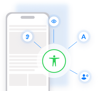
Accessibility testing helps developers, creators, and designers ensure the content they create for websites and mobile applications doesn’t exclude anyone and people with disabilities can access, browse, and use the website. It ensures the content is accessible for all people with a wide array of disabilities, such as vision impairments, hearing, physical impairments or other cognitive conditions, so they can consume content in their own way.
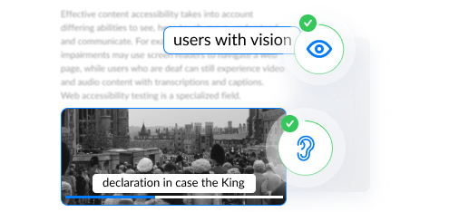
Effective content accessibility takes into account differing abilities to see, hear, touch, move, understand, and communicate. For example, users with vision impairments may use screen readers to navigate a web page, while users who are deaf can still experience video and audio content with transcriptions and captions.
Web accessibility testing is a specialized field. It impacts devices from mobiles to desktop computers, as well as the assistive technologies (like braille or screen readers) that work on those platforms. Therefore using an inbuilt advanced accessibility testing tool simplifies the complex process of ensuring your content adheres to modern accessibility standards and the constantly changing best practices.


in 13 languages
medical terminology), and build custom dictionaries
What does an accessibility checker do?
An accessibility checker ensures content created in your rich text editor complies with the globally recognized accessibility standards. This allows all readers or consumers of content to share the exact same content experience that the author intended and without discrimination or limitations.
It also solves a big problem with adhering to accessibility guidelines: most content authors are simply unaware of them. But by using an accessibility checker, you don’t have to be (or hire) an expert in web accessibility to make your web content compliant.
An accessibility checker enables your content authors to check the content they create for accessibility problems – using a simple in-editor dialogue.
An accessibility checker ensures content created in your rich text editor complies with the globally recognized accessibility standards. This allows all readers or consumers of content to share the exact same content experience that the author intended and without discrimination or limitations.
- WCAG
- Section 508
The built-in repair feature takes users through any identified issues and may even automatically correct the error on their behalf. It provides a handy step-by-step guided workflow for your content creators, helping to fix non-compliant HTML, ALT tags, and other tags with a click of a button - no developers are needed.
Accessible content = regulatory compliance

- Formats content for assistive technologies and screen readers
- In-editor dialog and repair feature that corrects any errors
- Stops non-compliant content being published
- Exceeds WCAG standards
- Avoids potential fines and lawsuits
- Ensures legal compliance
If you like the sound of this tool, explore it more.

Get 99.9% accurate
clean-copy-paste
Eliminate broken links by knowing if a link is valid,
invalid, or questionable
What is mobile accessibility
Mobile accessibility refers to the practice of making a website or app more accessible when it’s used on mobile phones or other mobile devices, like smartwatches, IoT devices, tablets, and dashboards. Mobile accessibility requires a slightly different approach to general web accessibility, because it has unique issues, like.
- Touchscreens
- Is used in different settings (indoors vs outdoors)
- Has different input methods (speech vs touch)
- Reduced screen sizes, compared to a PC or laptop
- W3C WAI Accessibility Standards cover general accessibility best practices that apply to both mobile and desktop devices.

Why accessibility matters
Building an inclusive website or mobile app with inclusive content, means you’re providing the same level of user experience (UX) to all users (impaired, disabled or otherwise) of your site. However, it’s important to start web accessibility from the very beginning of the planning process, as part of your underlying design. Doing so reduces the time, cost, and effort involved in inserting accessible elements into your website, as compared to doing it at a much later stage in implementation.
Don’t be deceived though, accessibility is in no way, shape, or form an edge case – it impacts 100% of your users – because on a daily basis, in certain circumstances, everyone experiences situational and temporary disabilities. And when those situations happen, everybody who’s using your product (digital or physical), experiences the same or similar limitations as someone with a more permanent impairment. So, being accessible benefits everyone.
Accessibility testing standards
The best accessibility testing tools and checkers ensure content authors comply with well-defined global standards such as WCAG and Section 508. Standards like these aim to ensure that technologies and web content (including audio and visual elements) are accessible to people with disabilities. For example, ensuring all images are accompanied by alternative text (alt text) that can be read aloud by a screen reader, and that users can navigate effectively by only using a keyboard (ie. without a mouse).
An hour spent reading about web accessibility is a worthy investment. Check out:
Familiarize yourself with local accessibility laws
Localized accessibility laws that you also may want to understand include:
- America: ADA compliance
- Europe: European Accessibility Act
- Ontario: Accessibility for Ontarians with Disabilities Act (AODA)
- Australia: Disability Discrimination Act 1992
WCAG levels explained
WCAG standards are globally defined, and local jurisdictions (see above) implement legislation requiring organizations to meet the standards, and certain levels of compliance (A, AA, AAA). Those jurisdictions’ requirements vary depending on local political climates and advocacy groups. A globally utilized accessibility checker should therefore adhere to the recognised WCAG 2.1 and WAI-ARIA specifications, taking into account that the WCAG specification allows for different levels of compliance (A, AA, AAA), with AAA being the most stringent set of accessibility rules.
However, discretion in the level of compliance used doesn’t only happen on a jurisdictional level. Organizations (for example a large Telco with a self-serve component for customers), may choose to adopt WCAG AAA voluntarily (because it’s best practice) even if they’re not required to by law in their jurisdiction.
An advanced accessibility checker that’s built into your rich text editor, should allow the content author to set the level of compliance that they want (ie. A to AAA). This feature helps authors who have large content stores to gradually improve compliance over time, as certain changes could require structural code changes which may not always be feasible.
Ideally, users should also be able to use the tool programmatically via its APIs, thus allowing developers to further automate accessibility checking as part of their quality control process.
What does a great web accessibility testing tool need?
It needs to account for and maintain an ongoing adherence to WCAG rules and how they should be implemented:
- Many of the accessibility rules can be confusing (e.g. slight variations for very specific cases, seemingly contradicting rules with nuanced differences etc), so the checking tool needs to balance checking everything important and not overwhelming the user.
- The level of checking (see above section on WCAG level of compliance from A to AAA) should be able to be customized and allow for some websites, apps and platforms that have custom HTML (e.g. widgets, third party widgets etc) to not be checked, if the author doesn’t want it done.
A thorough knowledge and understanding of how different browsers and accessibility tools handle accessibility related HTML features:
- With screen readers, there are many instances where they read HTML differently, or require different HTML to read anything at all, so you need to know how to write accessible HTML so that it works for all screen readers, or as many supported screen readers as possible.
- It’s unknown which screen reader the person is using (and unlike OS, browsers etc that can’t be detected), so the HTML needs to be written in an accessible format.
Accessibility testing checklist
Here are 12 tips to help make your website, application and content, more accessible.
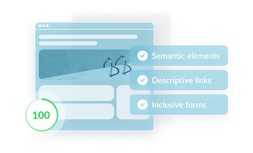
Use semantic elements
This is one of the best ways to make a website accessible and user-friendly, but also one that’s often ignored. Semantic HTML elements (such as <header>, <footer>, <main>) clearly communicate their purpose and the type of content within them. Using semantic elements enables users of screen readers to more easily navigate through your content.
Enable content to be accessed through the keyboard alone
In some cases, users may be unable to use a mouse or trackpad. Instead, they may only be able to access content through the use of a keyboard or alternative input device (such as a head stick). These users rely on the “tab” and “arrow” keys to navigate through the webpage.
- Ensure all content can be accessed with the keyboard alone, in a logical way that matches the visual structure
- Provide keyboard shortcuts wherever possible
- Break up large portions of text
- Avoid using elements that only activate on mouse hover.
Provide “alt” text for non-decorative images
For users who are unable to see images, it’s important to provide an alternative way for them to understand the information in the visuals. To aid these users:
- Add alt text (alternative text) to images so screen reader users can perceive the information relayed by the image
- Make sure the alt text is detailed and descriptive
- If possible try to avoid using images that contain text. If an image does contain text, include it in the alt text.
- If the image conveys complex information such as graphs or charts, include a link to a separate page with a text description of the same.
Include descriptive link names
Screen reader users can sometimes skip over content and scan for links. In these cases, phrases like “learn more” or “click here” do not provide any context or information about what the link relates to or provides. To aid these users, give them more context by using descriptive link text, like “learn more about how to make web pages accessible” or “click here to register for XYZ”. In places where this is not possible, the aria-label attribute can be used to aid screen reader users by adding context. And image links need alt text that describes the link, otherwise, screen readers read the link’s file name.
Use color inclusively
Avoid solely using colors to deliver information. The most common color deficiency is the inability to distinguish between red and green. For example, using only red and green to indicate errors or correctness in a form field would be unhelpful. However, the use of color is useful to people with learning disabilities, therefore ensure you use both color and other visual cues, to benefit both sets of users. Additionally, use optimal color contrast between the background and text colors, to help low vision users.
There are plenty of tools around that can help you analyze the contrast between your foreground and background colors.
Design inclusive forms
Online forms can be daunting for all of us, even with full use of vision and motor abilities. Designing accessible forms can significantly improve a user’s experience. Some points to remember when implementing forms are:
- Clearly indicate the field with focus and make it stand out from the background.
- Tabbing using the keyboard should allow for logical navigation through all the form fields as well as the “Submit” button at the end.
- Provide a clear relationship between labels and their corresponding fields, because screen readers sometimes guess labels if they aren’t properly associated with fields, and this can produce undesirable results.
- Avoid using only placeholders as labels, especially in autocomplete forms.
- Placeholders are hidden from screen readers and are also not good for color contrast.
- Make sure aria-labels match the visual labels on buttons.
- Avoid using captcha, but if needed, use text-based captcha.
- Provide the ability to extend the time limits to complete forms. Include a confirmation page that allows users to go back and edit the form if required.
Make text accessible
Tables should only be used to provide tabular content, because using tables to structure a page can be confusing for screen reader users. Instead, consider using CSS flex or grid for page layout. Elderly and low vision users also often zoom-in on content for reading, therefore, it’s essential to allow for readable content when zoomed up to 200%.
Here are some additional ideas to make the text on your web pages more readable:
- Use text instead of symbols – symbols can have ambiguous meanings
- Make link text look significantly different from plain text
- Expand abbreviations
- Avoid justified text
- Use the “lang” attribute to define the language of the elements in the webpage
Use ARIA roles and attributes where necessary
The Web Accessibility Initiative – Accessible Rich Internet Applications (WAI-ARIA), published by the World Wide Web Consortium (W3C), is a comprehensive set of technical specifications for adding accessibility information to HTML elements. These can be incredibly powerful when used to add details to help screen reader users interact with elements, or to hide information that doesn’t provide value to them.
For instance, ARIA “roles” define what an element is or does, “properties” are used to give them extra meaning or semantics, and “states” are special properties that define the current conditions of elements, such as aria-disabled=”true”, which specifies to a screen reader that a form input is currently disabled. However, it’s important to note that ARIA roles should only be used to make native elements accessible, not to replace them. For example, it is better to use the <nav> element that already indicates that the content within it is for navigation purposes than to use the ARIA navigation role.
Make dynamic content accessible
Modern websites often include content that changes dynamically, for example, task percentages, status updates, and personalized content. Dynamic content also includes audiovisual elements, such as sound, video, animation, and graphical images. Screen readers usually ignore dynamic content, but it is vital that these elements are inclusive, and that all users’ needs are considered when used.
ARIA attributes are particularly useful to make these elements accessible. Here are some additional ideas to increase accessibility:
- Include closed or open captions on video content, and text transcripts for audio content
- Add accessible controls to videos and avoid auto-playing content
- Provide text descriptions and a way to control image sliders or carousels
- Add a method to stop moving text
- Avoid auto-submitting forms or making significant changes to context within the page
- Minimize content that changes on focus or hover
- Alert users to any changes in the webpage content
- Allow status messages to stay open until dismissed
- Avoid adding a script that moves focus to itself
Don’t use CSS to present critical information
Screen readers do not read any CSS, and CSS-only images are hidden in high contrast mode. So, it’s best not to provide essential information through CSS.
Reduce flickering
Screen readers do not read any CSS, and CSS-only images are hidden in high contrast mode. So, it’s best not to provide essential information through CSS.
Test for accessibility using the right tools
Make screen reader testing a priority and a natural part of the web and app testing ecosystem. This helps to identify inaccessible elements early in the process. Additionally, it helps to have a WCAG specification or inclusive design checklist to refer to during development. If you’re using a CMS (Content Management System), choose accessible themes, and check that the CMS and its text editor have been designed with accessibility in mind.
There are a variety of free and paid resources that help produce accessible content and detect inaccessible elements in your webpages. These tools include color contrast checkers and browser extensions like the Axe tool, that comb the web page for accessibility bugs.